Designing Jatin Kampani’s website—and learning to let art breathe.
Some projects demand loud design—layers, gradients, motion, the works.
And then there are projects that look you in the eye and say:
“Don’t perform. Just reveal.”
Building the website for Jatin Kampani, whose images speak in light, texture, and emotion, was exactly that kind of project.
From day one, the mandate was beautifully simple:
Let the photography take center stage. Keep everything else invisible.
That became the creative compass.
A Clear Vision Leads to Clean Execution
A project is only as smooth as the collaboration behind it.
Working with Tonya Kampani on this site was a rare pleasure—she brought clarity, decisiveness, and a sharp understanding of what the digital presence should feel like: refined, minimal, intentional.
No scattered requests.
No endless aesthetic debates.
Just a shared belief that the work itself deserves the spotlight.
That alignment made the website less of a design exercise and more of a creative flow.
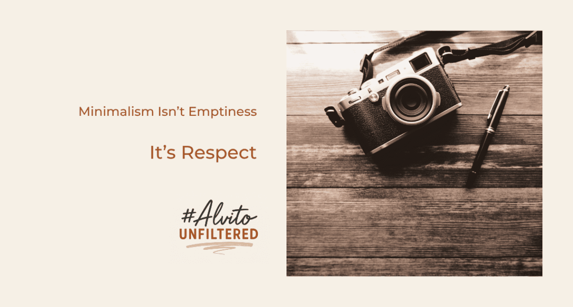
Minimalism Isn’t Emptiness—It’s Respect
We chose silence over spectacle.
- Generous negative space
- Unobtrusive typography
- A monochrome palette that never competes with the visuals
- Navigational clarity: Work. About. Contact.
This wasn’t minimalism for the sake of being “clean.”
It was minimalism as a form of respect for the art.
When an image arrests you mid-scroll, you don’t clutter it with animations and scroll-jacking. You bow to it. You allow it space.
Great design isn’t always about adding.
Often, it’s about refusing to dilute what already has power.
A Gallery That Also Works Like a Professional Portfolio
The site had to do more than showcase beauty—it had to enable discovery, inquiries, and future updates. So the build focused on:
- Fast loading of high-resolution visuals
- Responsive galleries across devices
- A flexible backend to add new work easily
- A subtle flow from inspiration → inquiry
Because while the site feels like a gallery, it still has to perform like a business tool.
What This Project Taught Me
Not as a designer, but as a creator:
- Sometimes the most powerful design is invisible.
- Simplicity reveals the truth of the work.
- When the content is extraordinary, your job is to hold the torch, not steal the stage.
We often assume design must amplify creativity.
This project reminded me that sometimes design must get out of its way.
Why This One Stays With Me
It reminded me why I build things—not to showcase my skills, but to help meaningful work travel further.
This wasn’t a showcase.
It was a quiet stage.
The spotlight wasn’t ours.
And that felt right.
A Thought for Creators
Instead of asking “How do I stand out?”, try this:
What truth am I trying to show—and what must I remove so it can be seen clearly?
Sometimes your work doesn’t need volume.
Just space.
Visit the website for more information: https://jatinkampani.com/
#AlvitoUnfiltered #DesignWithPurpose #VisualStorytelling #CreativeCollaboration #MinimalistDesign #CleanDesign #PortfolioDesign #UserExperience #DigitalAesthetics #ArtDirection #CraftOverNoise #CreateWithIntention
![]()


